The setup for a weekly analysis habit: what happens when I write a post, why old posts never re-run, and where the code lives.
Author
Ben Ballard
Published
August 18, 2026
This is the first post, so it may as well document the machine.
The goal is a weekly analysis habit with as little friction as possible between “I wonder about X” and a published page. Two things usually kill that habit: the publishing step being annoying, and old work breaking when you rebuild the site. Both are solved below.
The URL comes from the folder name, so index.qmd is always the file I edit. Data, images and scratch files for a post sit next to it instead of in a shared data/ pile that nobody can untangle six months later. A post is self-contained enough to delete in one move.
The date prefix in the folder name is for my benefit when sorting files; the date the site actually uses is the date: field in the YAML header.
Old posts never re-run
The setting doing the most work on this site is one line in _quarto.yml:
execute:freeze: auto
Without it, every rebuild re-executes every post. That means last year’s analysis re-hits an API that may have changed its schema, or needs a credential I’ve since rotated, or quietly produces different numbers because the upstream data was revised — and the published post silently changes underneath a conclusion I wrote about the old numbers.
With freeze: auto, a post executes once. Its outputs get written to _freeze/ and are reused forever after, until I edit that post’s source. Rebuilding the site becomes a pure markdown-to-HTML operation for everything except the post I’m actually working on.
The consequence worth remembering: _freeze/ is committed to git. It is not a cache to gitignore, it is the record of what the code returned on the day it ran.
Code is present but out of the way
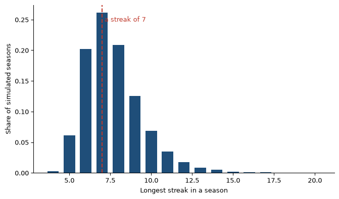
Code blocks are collapsed behind a toggle by default, set once in posts/_metadata.yml. The prose reads first; the method is one click away. Here is a real one — a check on whether a coin-flip streak of 7 is actually unusual over a season’s worth of flips, which is the kind of “that seems surprising” claim that is usually just sample size.
Code
import numpy as nprng = np.random.default_rng(seed=42)def longest_streak(flips): best = current =1for i inrange(1, len(flips)): current = current +1if flips[i] == flips[i -1] else1 best =max(best, current)return besttrials =10_000n_flips =162streaks = np.array([ longest_streak(rng.integers(0, 2, size=n_flips))for _ inrange(trials)])print(f"median longest streak: {np.median(streaks):.0f}")print(f"share of seasons with a streak of 7 or more: {(streaks >=7).mean():.1%}")
median longest streak: 7
share of seasons with a streak of 7 or more: 73.4%
A run of seven is the typical outcome, not the surprising one. That is the whole genre of post I want to write here.
Code
import matplotlib.pyplot as pltfig, ax = plt.subplots(figsize=(8, 4.5))values, counts = np.unique(streaks, return_counts=True)ax.bar(values, counts / trials, color="#1f4e79", width=0.7)ax.axvline(7, color="#c0392b", linestyle="--", linewidth=1.5)ax.text(7.15, ax.get_ylim()[1] *0.9, "a streak of 7", color="#c0392b", fontsize=10)ax.set_xlabel("Longest streak in a season")ax.set_ylabel("Share of simulated seasons")ax.spines[["top", "right"]].set_visible(False)plt.show()
Figure 1: Longest run of identical outcomes in 162 fair coin flips, across 10,000 simulated seasons.
Referring to it as Figure 1 gives a numbered cross-reference that works in every output format, which matters for the next section.
Interactive where it helps
Plotly figures work on the web version of a post:
Code
import plotly.express as pxfig = px.bar( x=values, y=counts / trials, labels={"x": "Longest streak in a season", "y": "Share of seasons"}, template="plotly_white",)fig.update_traces(marker_color="#1f4e79")fig.update_layout(height=400, margin=dict(l=40, r=20, t=20, b=40))fig
(a) Same distribution, hover for exact values.
(b)
Figure 2
The tradeoff: an interactive figure cannot render into a PDF or a PowerPoint slide — it is JavaScript, and there is nothing for a static page to show. So any post I also want as a document uses matplotlib. The next post is about exactly that.
Publishing
quarto preview while writing, then commit and push. A GitHub Actions workflow renders the site and deploys it. Because _freeze/ is in the repo, that build does not need my API keys or my local data — it only executes posts whose source actually changed.
That is the entire loop: make a folder, write, push.
Source Code
---title: "How This Site Works"description: > The setup for a weekly analysis habit: what happens when I write a post, why old posts never re-run, and where the code lives.date: 2026-08-18categories: [meta, quarto, tooling]---This is the first post, so it may as well document the machine.The goal is a weekly analysis habit with as little friction as possiblebetween "I wonder about X" and a published page. Two things usually killthat habit: the publishing step being annoying, and old work breakingwhen you rebuild the site. Both are solved below.## A post is a directoryEvery post lives in its own folder under `posts/`:```posts/ 2026-08-18-how-this-site-works/ index.qmd 2026-08-25-something-else/ index.qmd data.csv```The URL comes from the folder name, so `index.qmd` is always the file Iedit. Data, images and scratch files for a post sit next to it instead ofin a shared `data/` pile that nobody can untangle six months later. Apost is self-contained enough to delete in one move.The date prefix in the folder name is for my benefit when sorting files;the date the site actually uses is the `date:` field in the YAML header.## Old posts never re-runThe setting doing the most work on this site is one line in `_quarto.yml`:```yamlexecute:freeze: auto```Without it, every rebuild re-executes every post. That means last year'sanalysis re-hits an API that may have changed its schema, or needs acredential I've since rotated, or quietly produces different numbersbecause the upstream data was revised — and the published post silentlychanges underneath a conclusion I wrote about the old numbers.With `freeze: auto`, a post executes once. Its outputs get written to`_freeze/` and are reused forever after, until I edit that post's source.Rebuilding the site becomes a pure markdown-to-HTML operation foreverything except the post I'm actually working on.The consequence worth remembering: **`_freeze/` is committed to git.** Itis not a cache to gitignore, it is the record of what the code returnedon the day it ran.## Code is present but out of the wayCode blocks are collapsed behind a toggle by default, set once in`posts/_metadata.yml`. The prose reads first; the method is one clickaway. Here is a real one — a check on whether a coin-flip streak of 7 isactually unusual over a season's worth of flips, which is the kind of"that seems surprising" claim that is usually just sample size.```{python}import numpy as nprng = np.random.default_rng(seed=42)def longest_streak(flips): best = current =1for i inrange(1, len(flips)): current = current +1if flips[i] == flips[i -1] else1 best =max(best, current)return besttrials =10_000n_flips =162streaks = np.array([ longest_streak(rng.integers(0, 2, size=n_flips))for _ inrange(trials)])print(f"median longest streak: {np.median(streaks):.0f}")print(f"share of seasons with a streak of 7 or more: {(streaks >=7).mean():.1%}")```A run of seven is the *typical* outcome, not the surprising one. That isthe whole genre of post I want to write here.```{python}#| label: fig-streaks#| fig-cap: "Longest run of identical outcomes in 162 fair coin flips, across 10,000 simulated seasons."import matplotlib.pyplot as pltfig, ax = plt.subplots(figsize=(8, 4.5))values, counts = np.unique(streaks, return_counts=True)ax.bar(values, counts / trials, color="#1f4e79", width=0.7)ax.axvline(7, color="#c0392b", linestyle="--", linewidth=1.5)ax.text(7.15, ax.get_ylim()[1] *0.9, "a streak of 7", color="#c0392b", fontsize=10)ax.set_xlabel("Longest streak in a season")ax.set_ylabel("Share of simulated seasons")ax.spines[["top", "right"]].set_visible(False)plt.show()```Referring to it as @fig-streaks gives a numbered cross-reference thatworks in every output format, which matters for the next section.## Interactive where it helpsPlotly figures work on the web version of a post:```{python}#| label: fig-interactive#| fig-cap: "Same distribution, hover for exact values."import plotly.express as pxfig = px.bar( x=values, y=counts / trials, labels={"x": "Longest streak in a season", "y": "Share of seasons"}, template="plotly_white",)fig.update_traces(marker_color="#1f4e79")fig.update_layout(height=400, margin=dict(l=40, r=20, t=20, b=40))fig```The tradeoff: an interactive figure cannot render into a PDF or aPowerPoint slide — it is JavaScript, and there is nothing for a staticpage to show. So any post I also want as a document uses matplotlib.[The next post](../2026-08-18-one-source-many-outputs/) is about exactlythat.## Publishing`quarto preview` while writing, then commit and push. A GitHub Actionsworkflow renders the site and deploys it. Because `_freeze/` is in therepo, that build does not need my API keys or my local data — it onlyexecutes posts whose source actually changed.That is the entire loop: make a folder, write, push.